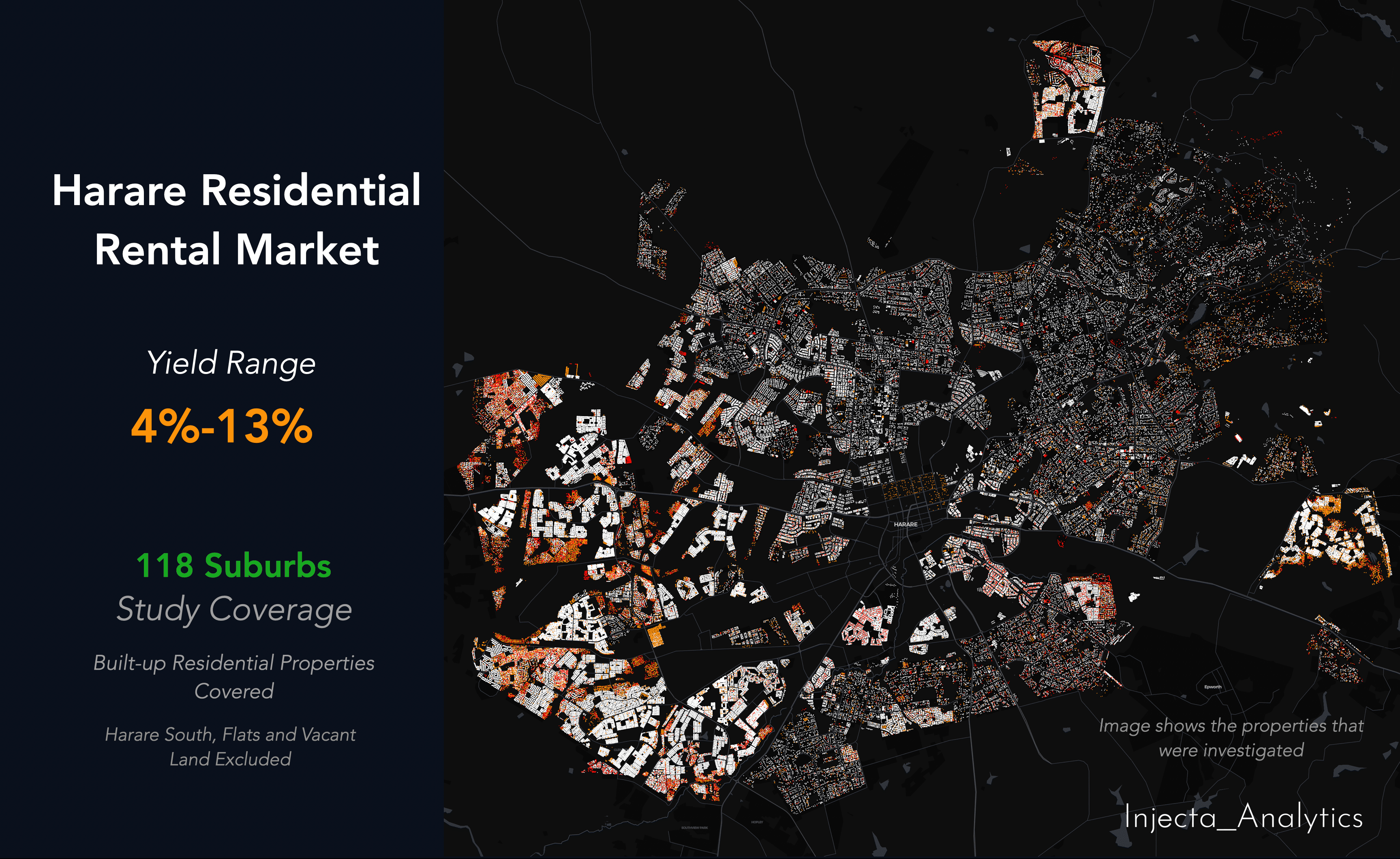
In our first analysis (click here to read full article), we mapped Harare's formal residential property market and found a USD 21.58 billion asset base, 119 suburbs, and 204,206 built-up properties. We ended with a provocation: perhaps the next advantage in this market will not come from seeing more property, but from seeing the same property more clearly.
This is the next layer of clarity.
We have now added rental data across 118 suburbs, computing gross rental yields and Price-to-Rent ratios for every formal residential suburb in the city. What the data reveals is not simply how much properties earn, it is whether the prices being paid across the market are actually justified by the income those properties generate.
The answer, depending on which suburb you are looking at, ranges from comfortably supported to structurally fragile.
Scratch the Surface and the Market Splits in Two
The median gross rental yield across Harare's 118 formal residential suburbs is 6.09%. The yield range runs from 4% at the most compressed end to 13 % at the highest. That is a 9.0 percentage point spread from one end of the city to the other and it maps almost perfectly onto the price spectrum. The most expensive suburbs have the lowest yields. The most affordable have the highest.
The monthly rental picture makes this concrete. Ultra-Premium suburbs command USD 1,450 to USD 2,750 per month. Premium suburbs range from USD 750 to USD 1,600. Mid-Market suburbs sit between USD 450 and USD 1,125. And in Affordable suburbs, rentals run from USD 250 to USD 450 per month. The income is real across every tier, but the relationship between that income and the capital value sitting beneath it is where the tiers diverge sharply.
This is not a coincidence. It is a structural signal.
The Inversion That Every Investor and Lender Needs to Understand
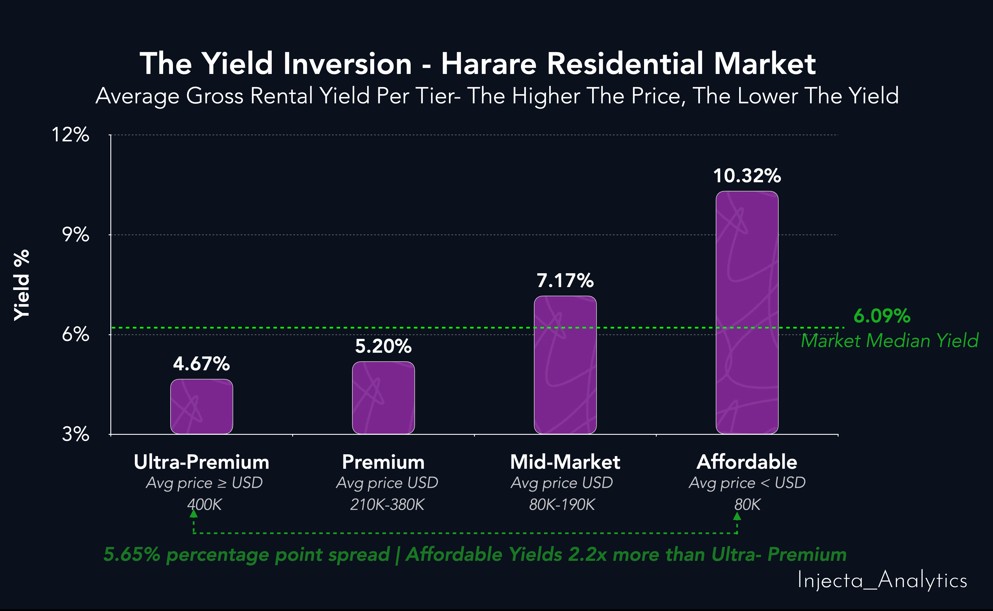
Our analysis groups Harare's suburbs into four price tiers. The yield picture across those tiers is unambiguous.
Ultra-Premium suburbs - those with average property prices above USD 400,000 yield an average of 4.67%. The Premium tier averages 5.20%. The Mid-Market tier averages 7.17%. And the Affordable tier suburbs averaging below USD 80,000 per property yield an average of 10.32%.
That is a 5.65 percentage point spread between the top and bottom tier. Affordable suburbs yield 2.2 times more than Ultra-Premium suburbs on average.
For any institution with capital deployed in Harare's northern suburbs, the cluster houses, the sectional titles, the premium developments, this is a number worth examining carefully. A 4.67% gross yield on a USD 500,000 property is a very different investment proposition to the same yield from a fundamentally priced asset. The question is whether the capital appreciation expected from those assets is real, or whether it is the last leg of a momentum-driven price cycle.
The Rental Model At Play
Before reaching for conclusions about what the yield numbers mean, there is an important structural nuance that does not appear in any spreadsheet, but that anyone serious about this market needs to understand.
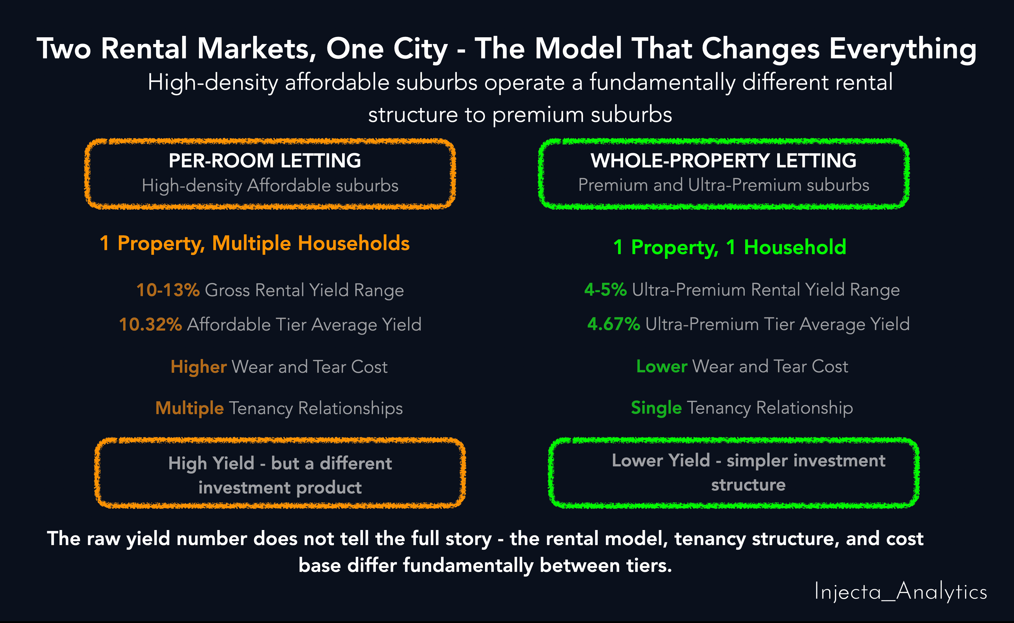
In Harare's high-density affordable suburbs, the rental market does not operate the way it does in the northern corridor. A two-bedroom house in Highfield, Kuwadzana, or Glenview is not rented to a single family. For instance, it can be divided to two, sometimes three or more households occupying individual rooms, each paying what they can afford. The aggregate rental income from one property letting to three households exceeds what a single-family tenancy would generate at market rates.
This is why the yield numbers in the affordable tier are high. But they come with a structural cost that the raw yield figure does not show. Multiple tenants mean accelerated wear and tear, higher maintenance frequency, more complex tenancy management, and greater operational demands on the landlord. The 10-13% yield in these suburbs is not free money. It is the return on a different investment model, one with a different cost base, a different risk profile, and a different investor type.
In the premium suburbs, by contrast, one household occupies the whole property. The rental relationship is simpler, the physical asset is better maintained, but the income return is lower.
Understanding this distinction matters enormously, not just for investors, but for insurers pricing risk, developers choosing product type, and banks assessing the income reliability of collateral in different parts of the city.
Where the Bubble Signal Is Building
The international reference point for property market overvaluation is the Price-to-Rent ratio, how many years of annual rental income it would take to equal the purchase price of a property. Above 20x is widely considered a bubble warning threshold. Above 25x is severe overvaluation.
In Harare, 35 suburbs have a Price-to-Rent ratio above 20x. The property value sitting in those suburbs is USD 7.21 billion - 33.3% of the total market.
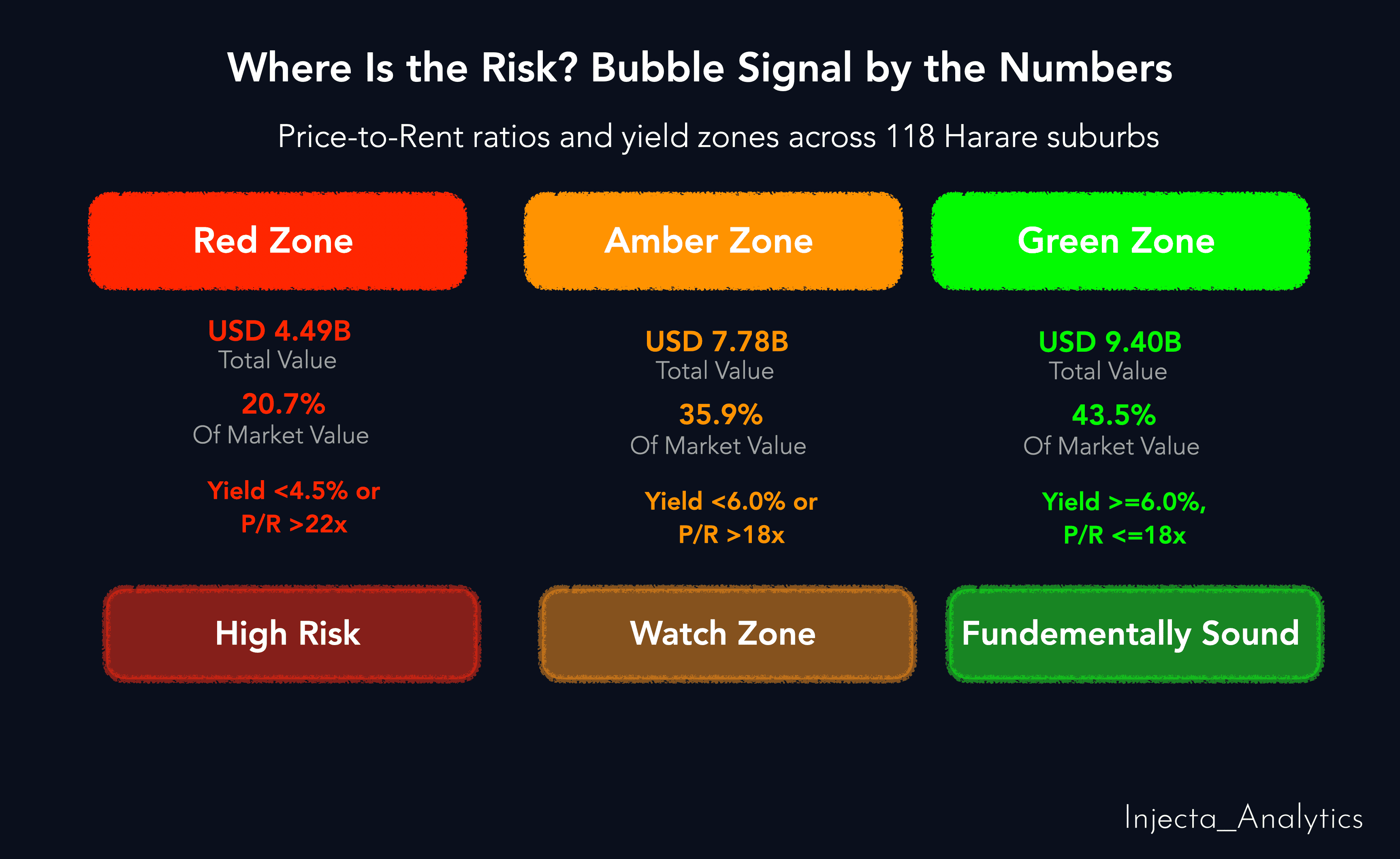
Our analysis classifies every suburb across three risk zones based on actual yield and Price-to-Rent data:
• RED zone: 21 suburbs, Prices have materially decoupled from rental fundamentals.
• AMBER zone: 31 suburbs, Elevated prices, yield compression present, requires monitoring.
• GREEN zone: 66 suburbs, Rental income fundamentally supports capital values.
RED and AMBER combined account for 52 suburbs, sitting in elevated risk territory.
For a bank underwriting a mortgage at today's peak valuation in a RED zone suburb, the collateral is priced on expectation, not on income. If institutional demand softens, if cluster house supply overshoots, or if the yield compression story reaches the mainstream, that collateral could correct. The loan would remain. The recoverable value would not.
The Part of the Market That Is Actually Sound
This analysis does not tell a uniformly alarming story. It reveals the differing dynamics in the property market.
58 suburbs meet a gross yield above 5.5%, a Price-to-Rent ratio below 20x, indicating genuine market depth. Those 58 suburbs represent USD 11.30 billion, 52.1% of total market value.
More than half the market, by value, is fundamentally sound.
The income return supports the capital value. The risk is not everywhere. But it is concentrated and that concentration is measurable, mappable, and actionable.
Assuming all properties in the study area are rented out, which of course is not possible, the total estimated annual rental market across all 118 suburbs is USD 1.43 billion. The mortgage market, by contrast, totals approximately USD 136.1 million across nine banking institutions. The ratio between annual rental income and formal mortgage lending in this market is extraordinary and it points not to a market that is broken, but to one that is waiting.
What This Means for Institutions Operating Here
The price tells you what someone paid. The yield tells you whether what they paid was supported by what the asset actually produces. These are different questions, and for a lender, an investor, or an insurer, the second question is the more important one.
A bank that prices mortgage risk using city-level averages is not managing risk. It is averaging it. The difference between a 4% yield suburb and a 10% yield suburb is not a footnote, it is the entire credit decision. In one, the income from the asset cannot service a meaningful mortgage. In the other, the rental income strongly supports the collateral value.
For pension funds and institutional investors who have concentrated positions in Harare's northern suburbs, the cluster houses, the sectional titles, the premium corridor; the 4.67% average yield on Ultra-Premium assets is a figure that deserves a conversation. Is that yield adequate compensation for the currency risk, the concentration risk, and the liquidity risk that comes with holding long-dated property assets in this environment?
For developers, the yield map is a demand signal. A suburb where yields are 4% is a suburb where the market has already priced in everything. A suburb where yields remain healthy is a suburb where genuine unmet demand still exists.
For the market as a whole, the rental yield data adds a second dimension to the picture our first analysis established. The USD 21.58 billion market is real. But the distribution of that income across the value base tells a story of structural divergence that requires suburb-level intelligence to navigate.
The price shows you the market. The yield shows you whether the market is telling the truth.